In what way does your media product use, develop or challenge forms and conventions of real media products?
Prior to creating my media product I did research into typical codes and conventions of a thriller film or TV series. The conventions of a typical thriller are very hard to establish as thrillers have many different sub genres, however one way of defining a thriller would be its ability to thrill an audience, typical conventions of a thriller would be; dark lighting, scary atmospheric music and usually a remote setting such as an abandoned warehouse or an old farm. In recent years thrillers have averted to more of a horror based theme, with the use of gore and gruesome imaging. My thriller doesn’t comply with this, my thriller is more psychological and is very minimalistic when it comes to shocking imaging. However this is only an opening sequence, it is not a short film meaning that it should only build the atmosphere to finish the film. The intension for my opening sequence was to get the audience thinking and questioning what has happened or what is going to happen. For example in sin city the opening sequence shows an man and a woman on a balcony in what appears to be a very built up city scape. As of this point the audience don’t know who either of the characters are, why they are in that situation or their relevance to the film. After a short conversation which gives no clue to the audience as to what is happening or what is yet to come, the man then shoots the woman and the camera does a swift zoom out to the bird’s eye view of the city landscape in which the film’s title emerges. In my thriller I have used a similar of idea of putting a death in the opening sequence in order to get the audience thinking what is going to happen next it creates suspense. But the film doesn’t actually show the victim killed, it is suggestive that he has been killed or that something bad has happened to him, this is done through the use of camera, mise en scene and lighting in the entrance of the second character into the victims home. My thriller conveys to the typical conventions of a thriller, in parts it is low lit and the music used is very eerie and dark. At the same time though I wanted to try and create a normality to the characters life, I wanted him to appear as a normal businessman however the twist was that he was carrying a gun with him to work, this makes the audience question him as a character. Why is he carrying a gun? What is it for? Is he the killer, is he going to kill somebody? But then he is killed off at the start, which then makes the audience question, who killed him? Why did they kill him? Was he carrying the gun for a reason? Or was he killed by his own gun? All of this gets the audience thinking as to what is going to happen next and builds the tension, keeping them thrilled on the edge of their seats. I took inspiration for my thriller from two opening sequences, Sin City and the opening sequence of the TV show Dexter. Sin city gave my thriller the cold dark murderous feel whilst Dexter gave me a feeling of normality with a sinister twist this Is explained in my evaluations of the two clips.
Social Group
The social group that my thriller represents are middle aged males between working and middle class. The two characters in the opening sequence. Typically the main characters in films are teenage males and females. This is probably because the typical audience of thrillers are young men and women usually between the ages of 16 and 25. My thriller is intended to be sophisticated and mature in the way that it tells a story. The story is typical of a thriller surrounded by murder and crime. The film is set in modern day however is in black and white giving it a classic feel, this makes it feel like a flashback dream of an elderly person about an event that surrounded them but set in modern day.
What kind of media institution might distribute your media product and why?
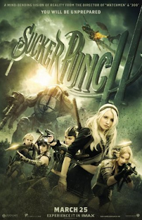
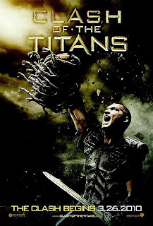
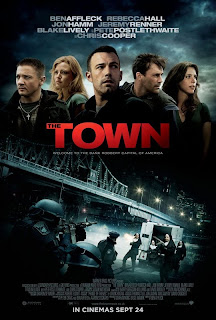
If I was to go professional I would like to re-create the film on a large budget and hopefully give it a more professional and higher quality feel. The distribution company that I would hope to distribute my media would be warner bros. Warner Brothers are an American based company however work co-ordination with some UK film producers. An example of this is the Harry Potter films, it was produced by a UK based company using British actors however it was distributed my Warner Brothers. This benefits Warner Brothers as they get a cut in the profits made in the film sale, and it also benefits the production company as they get their film endorsed by a well-known name in the industry. Benefits of this are, the film gets screened in more cinemas in the UK and in America as well as being able to use their name and logo in the advertisement of the film. Warner Brothers are an extremely well-known name in the film industry and are one of the oldest distribution companies. Examples of their work include new films such as “sucker punch”, “Clash of the Titans” and “Harry Potter and the Deathly Hallows Part One” I would be happy if warner brothers distributed my film as they are known for producing big blockbuster films usually in the genres of action, thriller and comedy. An example of a thriller distributed by them would be The Town, is is a crime based thriller and follows the life of a long term criminal as he tries to escape from the criminal world to continue a normal life.


How did you attract/ address your audience?
My target audience was young males between the ages of 16 and 25, I decided upon this through research into typical thriller audiences and this one was the most dominant. I addressed my target audience by creating a thriller which combined the two sub-genres of crime and psychological. These two genres especially crime are heavily watched by young men. The thrill surrounding murder and crime make for very appealing stories for young men, most violent crimes are associated with the male gender and so movies based upon crime and action have s specific appeal for men. My thriller is crime based, within the opening sequence of the film I kill off one of the characters shocking the audience and start creating an overall theme of murder and crime which will continue throughout the film.
What have you learnt about technologies from the process of constructing this product?
When constructing my product I have learnt a lot about the use of cameras, lighting and the positioning of cameras. I have learnt how to use advanced editing software and have gained an advanced understating of applying effects, transitions and the importing and exporting of files. I know through experience the importance of getting the ratio of the sequence correct to the way in which it was filmed as not to squash your image when it is exported. I tried to obtain the beat quality possible for filming and tried to maintain that quality during the importing, editing, exporting and uploading stage. Before I did this project I had no idea how to use Adobe Premiere pro, however now I feel that I have an advanced understating of how to construct a basic timeline and apply effects and audio to it. It is good to learn the theory of creating a film and gaining an understanding of the typical conventions. However it is much better if you are able to apply that theory and give it your own personal creativity and input. Then assessing yourself once you have created you piece of art, taking on constructive criticism and going back and seeing where you can improve learning new techniques and better ways of getting the desired effect you want.
Looking back at your preliminary task what do you feel you have learnt in the progression from it to the full product?
One very noticeable difference between my opening sequence and my preliminary task is the ratio for the video, it was during the process of creating my thriller that I learn the importance of getting the ratio of the sequence and the export size correct and that this would be dependent on the camera that I filmed with. I also feel that my use of titles and transitions is much more effective in my thriller and I apply the use of video effects and transitions much better in order to give the video a professional appearance. Overall I feel my use of camera angles audio and lighting has dramatically improved during the period between the creation of my preliminary task and my thriller opening sequence.
Richard Kish
Overall, I felt that the opening sequence was good but it seemed to lack the necessary hook that I would expect in a Thriller. Some of the camera angles were very clever and rather interesting and if they had been linked with a slightly more engaging narrative then they would have been really effective. I also thought that there certainly was evidence of the enigma code in the ending of the opening sequence and this was perhaps the most effective piece of the entire film. I did notice a few problems with the edit, mainly, some of the credits are impossible to read due to the black & white effect on the background, the music does not add the gravitas to the sequence like it probably should do and overall the sequence does not feel as thrilling or interesting as I would expect from the genre, but this might be a conscious decision.
Response to feedback
I understand Richards critical points of my film, I do feel that the overall feel of my film doesn’t create the thriller effect I wanted it to have to the best of my ability. The music was a mistake of communication on my behalf, the person that I asked to construct my music track viewed the wrong video that I intended, I directed him to be YouTube channel however didn’t make the title of the video I wanted him to make it to clear. As a result of this mistake I made, he created a really good track for me however it had been tailored to suit my first thriller I had created before I split from my group. I wasn’t able to ask for him to make changes to the track as I was running out of time to upload my final edit, so I risked using the track as it still had a thriller them and although didn’t work as effectively as I had hoped it still provided a background for my video. The credits was a difficult part of my film, the lighting was very bright and I had used a simple white text font for my credits, I did my best to position the credits as best as visibly possible without disrupting the look of the film.
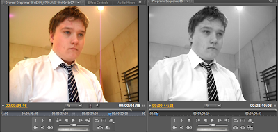
 The lighting in my house was very yellowy, it made the video look to happy and not as sinister which is what I was going for. Some films pull the black and white effect very well, such as Sin City however in Sin City certain objects are colourised such as the lady in the red dress during the intro and the green in her eyes. I would have used this in my film however I was unsure how to do this and so settled for a simple black and white effect. This effect was called tint. The second effect that I used in my film was a Luma curve, I used this on the entrance of the killer this emphasises the shadows in the shot and gives it a darker more ominous feel. Combined with the low angle this creates a very menacing image.


